skip to main |
skip to sidebar

Brian Taylor/Illustratorhttp://btillustration.com/
http://btillustration.blogspot.comAs you can see the hate is spreading faster than the swine flu. Today's post is donated by an illustrator who I'm privileged to work with. You can see Brian's work through the link above. He's illustrated for the Los Angeles Times, Billboard, USA Weekend, Variety, The Washington Post, and tons of other publications that probably use crappy fonts that we'll soon get to. Let's hear what Mr. Taylor has to say...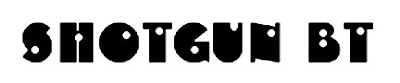 "You think you're all hardcore, don't you 'Shotgun BT'? You think because you got a couple bullet holes in your font, you can hang in the streets? You think just because you got the word 'shotgun' in your name I'm supposed to be afraid of you? Maybe in the 1920s you could hang, with all those lame old time gangsters with their tommy guns and zoot suits...But this is 2009, son. You just can't hang today. Fonts today would eat you alive. You look foolish. You look like a punk and a sucka."
 "Have you ever been used for anything? Has anyone ever said "Yeah, I want that font. The one with the retarded Pac-Man brothers, C, E & G" And what's with the letter 'F'? Is that really supposed to be an 'F'?"
 "And if you thought the letters were bad. Look at those numbers. Horrible. Just horrible. Shotgun BT, you are the worst!"
Special guest hater,
Brian Taylor
 Wow, look at this piece of work. Seriously, if you presented this font to anyone who lived in New York, they would probably choke you to death and sell your organs to Katz's Deli because they make anything taste good. It's like New Years Eve when people just wear random crap on their head just to look ridiculously stupid.
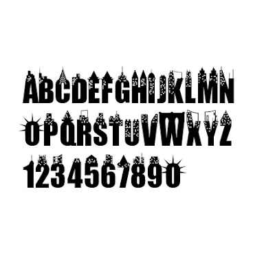 I seriously don't know where to start. The fact alone that IMPACT was blatantly raped and thrown to the curb just disgusts me. Or maybe IMPACT deserved it, who knows. All I'm saying is, if you're going to throw random idiocy on letterforms, don't stop at the numbers! No symbols whatsoever, so disappointing! Couldn't we get Yankee stadium on top of the dollar sign? JFK airport over the quotation marks? Cmon man, put some effort into your rape-age!
 Frank Sinatra wouldn't even offer a light to this font's cigarette. I'm sure he's up in heaven right now assembling the rat pack and descending to earth as poisonous girl scout cookies to eat out the insides of whomever designed this atrocity. In the end, don't mess with New York City! Unless it's the font, then you can do whatever I don't care.
This is Stupid Annoying Fonts. Here I will post all the fonts I hate and why. I hope you will hate them as well. Let us begin our hate of fonts together.
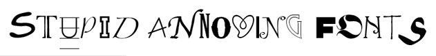
 If Jesus crash landed back to Earth from the outer dimensions of unknown time and space, rode into the hells of New York on a cactus and ordered a hot dog, you would get B Surfers.
 OK so A for effort on making an almost complete alphabet with the A standing for "Atrocious". Is that a goldfish inside the o's? and why does the @ symbol look mysteriously like an eyeball? Do people even have ankhs anymore?!? And it's like almost every letter has an attachable air conditioner on it or something, but that doesn't constitute this font as being cool...
 This guy's off to find the creator of this putrid eyesore and pop a cap his ace! I'd rather look at him for 2 minutes than the font itself. I bet you the pricks have poison in them and give all computers deadly viruses. For all I care, B Surfers can ride the waves of my middle finger back to the valley...