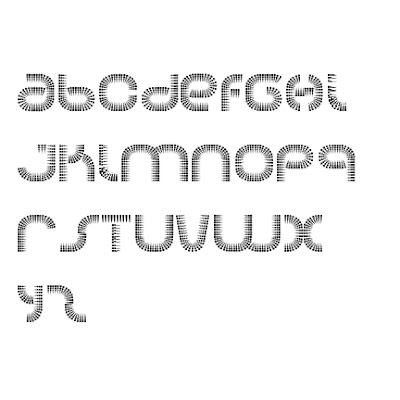
 You would think a font like this would be great on a hot summer day while lying in the pool with hookers in mermaid costumes, but no. Soda is like the RC Cola of fonts, what the hell is it, why was it created, and who the hell wants it? It's as flat, if not flatter, than Meg Ryan's chest.
 Oh yippee... spare me any lowercase fonts or numbers. While you're at it, please forget the symbols as well. If there's anything good about this font, it's that the H looks like a friggin Star Wars Tie Fighter that I can highly appreciate, but is destroyed by Luke Skywalker and Princess Leah (the twin I's and J's). Don't forget that highly aroused V either...
 This is probably the only use for a font like Soda. Slapped haphazardly like a rich mother who can't take care of her kids. Not even a two million dollar gym can work this waste of postscript into shape.


No comments:
Post a Comment