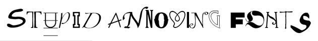
 Hmmm... more like, VERY BAD TYPE DESIGN!!! OF THE FACE!!! OK that sounded violent but nothing as violent compared to the displayed font. Right off the bat it's hard to categorize where this font would be used. For some reason I want to think Stone Age.
 If the objective of this font is to poorly draw lines over scanned felt tipped marker than that person succeeded with flying colors. I also can't get over the fact that some letters have serifs and others do not. What the hell man? A little consistency wouldn't hurt now would it? Although I do love how the O suspiciously looks like a condom imprint from far away.
 I hear ya Quas... To be honest, I prefer your posture over this font any day of the week. Even your spinal cord is far straighter than the inset lines. I just want to live in a world where letters have equal amounts of serifs, is that so much to ask? Is it?

No comments:
Post a Comment